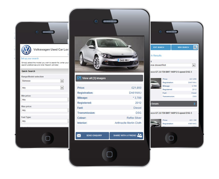
Mobile web design - Aiming for a resolution independent User Interface
Search Criteria: presented as blocks for distinction between choices aiding user interaction.
View Results: clear delineation between vehicles encouraging intended user selection.
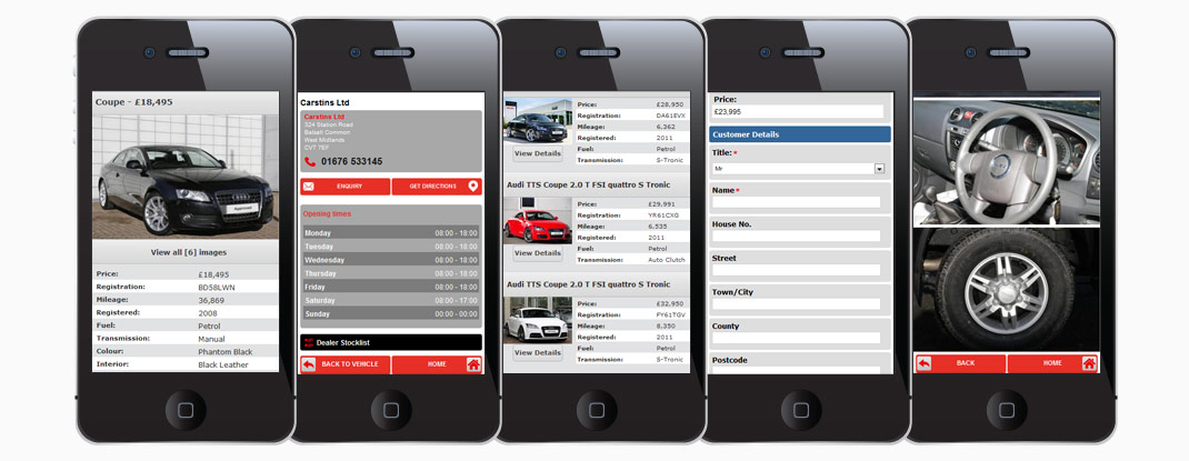
Select Vehicle: follow up vendor interaction possibilities clearly displayed.
Navigation combination of text and icons
Ease of navigation is enabled by defined areas for text labels with the addition of icons based on expected and accepted visual conventions. Icons alone are a risky option as visual communication is not a universal language. Text and icons provided clear navigation.
Mobile Used Vehicle Locator easily customised
Via CSS and assets swapping the Mobile Used Vehicle Locator is easily customised and has been rolled out to various Car Manufacturers and Car Dealerships.

Saab Used Cars website
Customisation of CSS and minor re-ordering of .aspx control mechanisms based on an existing product for Saab.
The clients advertising agency delivered branding CI PDF for interpretation and implementation.
Challenges included browser compatibility, & calling search function and pages into pre-existing Saab i–frame with flash navigation.
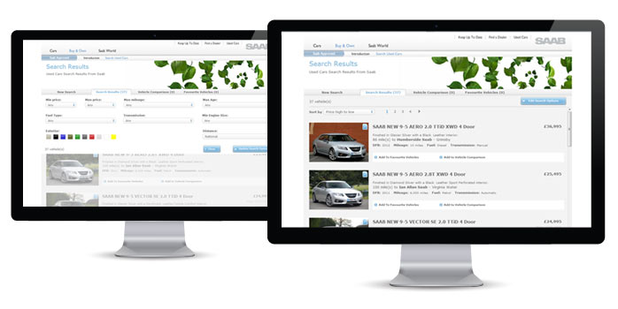
Saab redesign: results and amend search screens
Once initial search criteria is entered the user is provided with a list view of available vehicles, which can be amended to refine the results.
The vehicle selection screen allows the user to select multiple vehicle models and derivatives and then order results by criteria such as price and distance.
Production of model shots proved challenging due to asset photography taken at different times with varying lighting and post production.
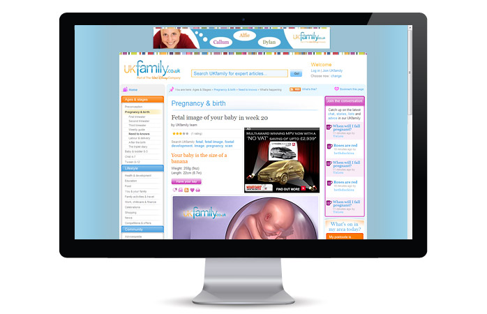
UKfamily website
As Lead Designer for UKfamily (a Disney company) I managed the visuals for the site, liaising with the agency tasked with the original design and the development agency for site interaction.
Concept, design and production of amendments to the design and assets to improve site speed and search engine visibility, alongside banner advertisement design & production and site photography Photoshopping to meet hefty editorial demands.
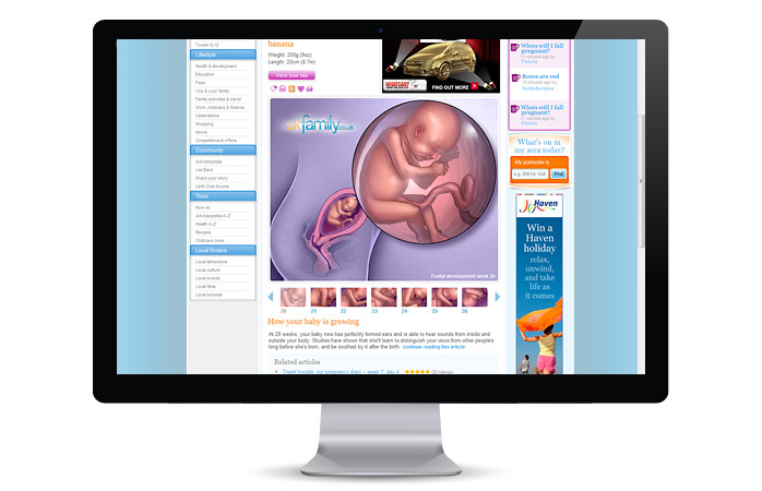
UKfamily website - Lead Designer
Seen here are screenshots of an in–page image viewing carousel designed to showcase bespoke illustrations, which I sourced and managed the commission of, allowing easy interaction and consumption by the user.

NotaCreative version 1
A personal site built entirely without images to showcase the properties, and beauty, of text (the web is 95% typography) that I conceived, art directed and partially front-end developed.
If as a web designer you think text “Ugly” then you're not actually a web designer you are a print designer playing at web… stop it.
visit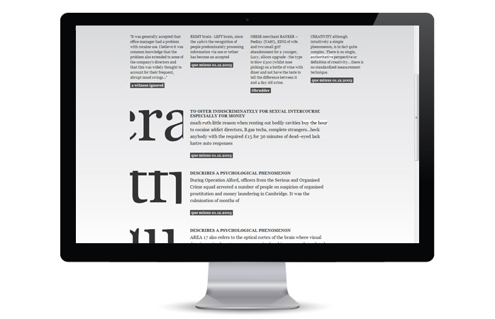
NotaCreative further down the page
A long page isn't a problem as long as relevant content encourages the visitor to keep on going. There is no fold.
The latest version of www.notacreative.co.uk is now live – but as a personal web testing area works best in a Chrome browser – why bother, on a PC, with anything else?
www.notacreative.co.uk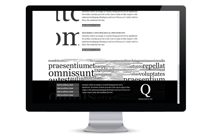
NotaCreative even further down the page
Despite being labelled a Flash hater I included some at the bottom of the page which was scripted to select associated words and randomly render them on the page. I've never hated Flash, but have always recognised it's limitation with regards to processor hogging, crash tendencies and closed content system.
Extolling the virtues of text as not only THE best form of online communication but also as aesthetic expression in itself.
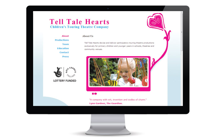
TellTaleHearts web design & build
Taking cues from the print design & branding I consulted, designed and front-end developed this brochure site for Children's Theatre Company Tell Tale Hearts.
I no longer look after the site
visit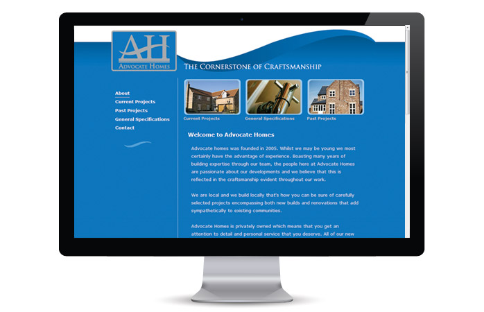
Advocate Homes web design & build
"Feature rich" is a term oft used by Print Designers playing at web who confuse visitors with multiple options, that are rarely used.
The targeted approach for websites has come to the fore thanks to the rise of mobile.
Advocate homes design stripped away ancillary guff well before targeted became fashionable, empathy as a user for the User Experience is key.
I no longer look after the site.
visit