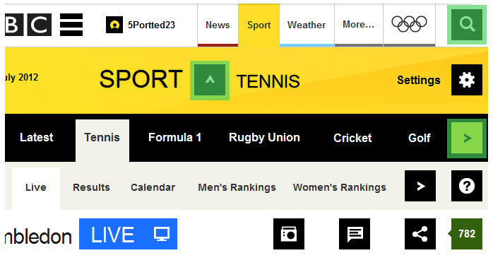
BBC responsive – touch sizes
Adding touch size considerations, aiming for a minimum of 2cm by 2cm, to a products responsive offering allows for greater breathing space and delineation of navigation and content, providing a comfortable layout for the user to readily digest that content.
Extending a font to include icons to aid navigation reduces http requests for images speeding the brand experience for wireless connections while avoiding image degradation on high pixel density devices.

BBC responsive concept – content block plan
Planning the layout based on content blocks and the hierarchical nature of cascading navigation leading to content given weight through a 40/60 split.
A menu system that is customisable via settings allowing Users to tailor the experience and focus on their sport(s) interests. Having the unused menus able to collapse allows reclamation of screen real estate.
A content system based on up/down selection followed by left/right content consumption could provide a commonality of delivery easing the site visitors through interaction repetition.
Navigation prominence to the fore through the need for finger friendly weight added to the importance of I.A. with the ability to easily reach desired destinations. With large numbers of navigation choices, as with sports, one possible solution would be a carousel.
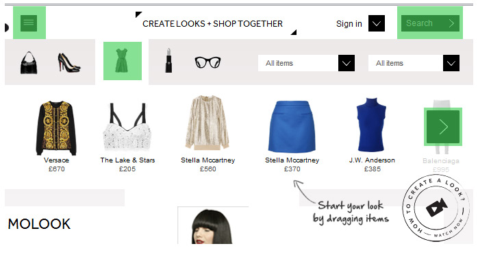
Motilo touch UI
Use of font angle brackets to indicate extended options available and opening and closing of panels containing extra information would allow for limiting extraneous image calls and maintain screen pixel density. The font options currently becoming available can facilitate this if buying and extending a chosen font is too expensive.

Motilo responsive concept layout content blocks
Exploiting the natural hierarchy present in accepted web conventions and utilising a cascading deployment of content allowing the site navigation to flow into product navigation and thence to User interaction with those products to build a “Look”.
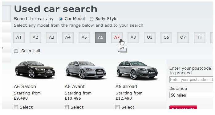
Audi UCL menu system after UX enhancements
A menu item has four states and once selected, taking you to a page, should ideally be disabled until navigated away from - saving unnecessary downloads.
Adding visual indicators to distinguish between inactive, active & selected helps the site visitor to navigate confidently.
Audi UCL menu system before UX enhancements
Realignment of the original menu notification to visually prompt the user and reassure that interaction has been successful. Allowing dev centric approach & considerations to deny the disabling of a clicked link can hinder The User and negatively impact the site experience.
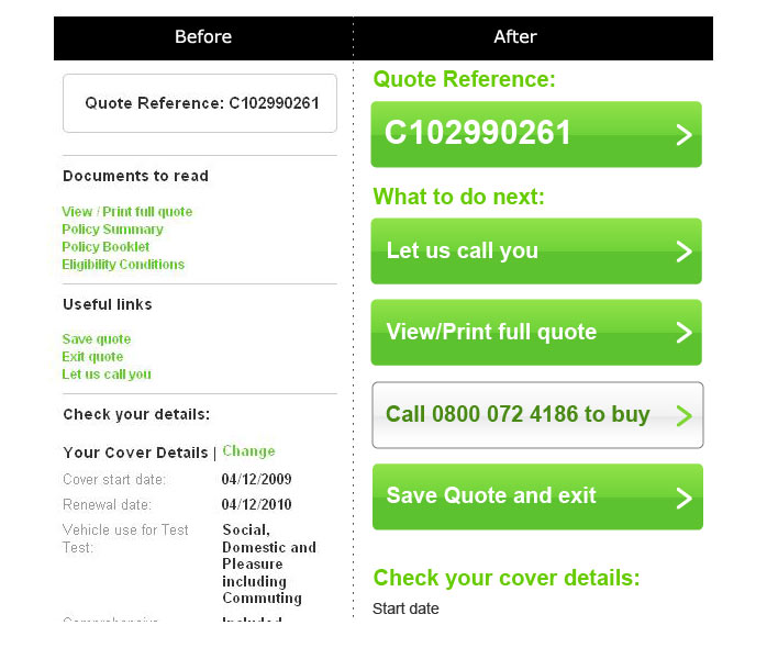
More Th>n form before & after
Reducing the pain inherit in forms can be as simple as upping font size to a comfortable reading size, and adding delineating white space. Many forms suffer from a development centric "it works" approach regarding functionality while ignoring layout which can aide the user to readily digest information.
Ease of comprehension allows for quicker completion & review thereby tackling common drop-out points in an e-commerce process.